- To post more 'inspirational' images, that help me decide what I want to do with my own magazine.
- Complete mock-ups to give me an idea of what I want my magazine to look like.
- Take test shots to use for my draft magazine.
- Fully complete my draft cover page, contents page and double page spread.
Friday, 18 February 2011
Areas for Improvement
After receiving back my mark scheme, I have realised the areas where I can improve my work:
Thursday, 17 February 2011
Artist Profile
Artist Name: Chris Recker
D.O.B: 6th June 1986
Nickname: ravage
Band Name: Ex6tense
Position: Drummer
Favourite Bands: Avenged Sevenfold, Metallica, Trivium, Slipknot, Linkin Park, Papa Roach, Halestorm
Bio: Chris Recker is the drummer for Ex6tense. He found his way at a talent contest at the age of 10, where he won with his drumming act. He played at small shows, and became noticed by agents who got him into his first big concert. He and his brother then formed Ex6tense.
His inspirations come from drummers such as James Sullivan, Mike Portnoy and Lars Ulrich
Logo Idea
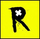
This is one of my possible logo ideas. I have put an 'x' in the middle of the 'R' to stand for the asterisk in my magazine name. The bright yellow helps the logo stand out.
Magazine Name
I have chosen to call my magazine
Rockst*r
I chose this name as I feel it fits well with the genre of my magazine. I've called it 'Rockst*r' instead of 'Rockstar' as Rockstar is the name of a current company, who creates computer games. I wouldn't want my magazine to get confused with the company. There is also another company with the name of Rockstar, who mainly make energy drinks. I got the idea for the asterisk in my name, as Rockstar commonly use a star instead of the a in 'star'.
I feel using an asterisk separates my magazine from the companies with the same name.
Tuesday, 1 February 2011
Photo Ideas
I really like this picture of Slash. I like the stance he has with the guitar - I think it works well with the black and white filter and the lighting used. I may try and recreate something similar this for my picture.
Colour Pallet
Colour Ideas Final
I was unable to decide between the Red, Blue, Purple and Green. I tested all of them out on a mock up and decided that the Green looked best with the rest of my magazine.
I was unable to decide between the Red, Blue, Purple and Green. I tested all of them out on a mock up and decided that the Green looked best with the rest of my magazine.
Font Ideas
All of the above fonts could possibly be used in my magazine. The fonts have an aggressive feel to them which match the genre of my magazine. They also have a grunge effect to them which would look good with the rest of my magazine.
Subscribe to:
Comments (Atom)


